
Today I continued my (one day old!) practice of a daily sketch. Just going out into the safety of our garden, which is in Autumnal mode here in Melbourne, Australia.
Its a great way to calm down, concentrate on a task in hand and develop skills. I plan on doing more of these observational plant sketches, where I’m really trying to sketch and paint what I see not what I think I see!
Daisies are so common, we all have a visual image of them in our memory banks, but each plant is quite different, I’m not sure of the name of my daisies – they came with the house. They grow in lovely clumps and have lots of feathery leaves.
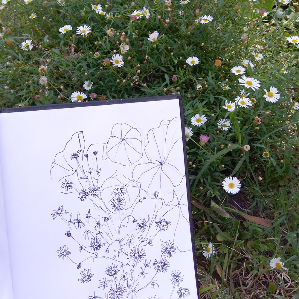
line drawing 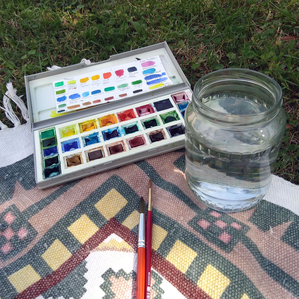
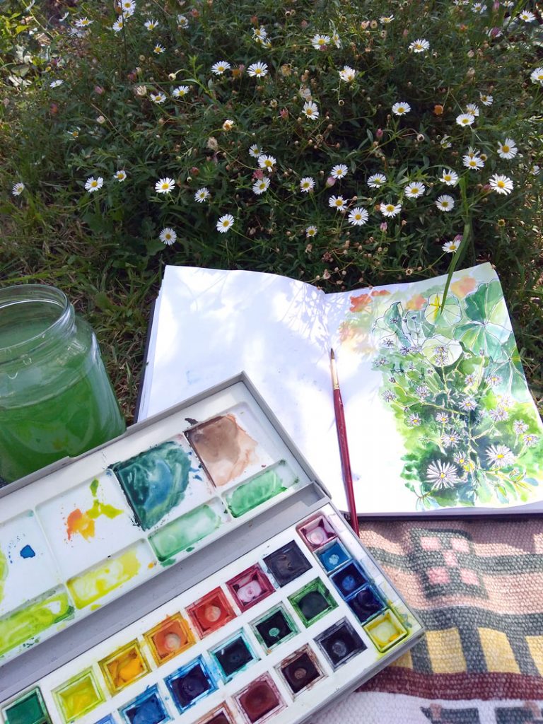
paints and water on my comfy picnic mat
I began by creating a line drawing using my Lamy Safari fountain pen, with waterproof ink by Artamentis.
I’m sketching in an A5 sketchbook, with a hardback that I really like for some reason, I don’t know why- the paper is really thin and the paint bleeds through to the next page, but I think it’s because I’m not precious about the book that I tend to try some experiments in it.
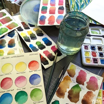
My watercolour paints today were my trusty Winsor & Newton set of artist quality watercolour paints that I’ve had for over 20 years!
I used lemon yellow, cadmium yellow, sap green, hookers green and Prussian blue.
With a size 8 round synthetic brush and a small Pentel aquash brush to get into the fiddly bits around the daisy petals.
Winsor & Newton pan set 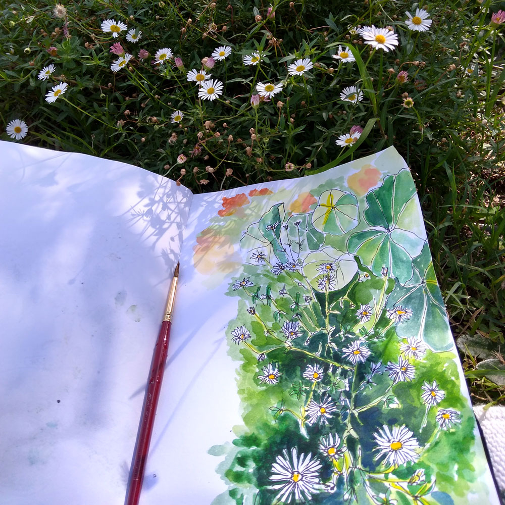
A5 sketch book
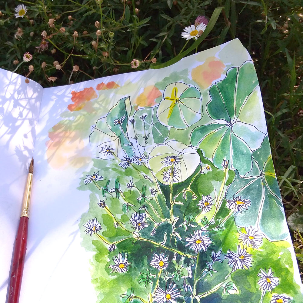
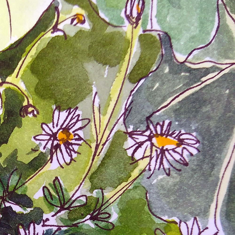
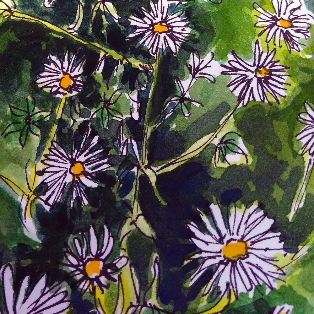
With today’s sketching I wanted to incorporate a bit of negative painting around the daisies to make them stand out and convey the sense of a mass of dark leaves at their base – without painting each individual leaf.
I started by painting the centre of the daises, I left the petals blank – so just used the white of the petal to create the most contrast I could between the flowers and background.
I then blocked out tonal colours of yellow/green throughout the picture.I painted the nasturtium leaves pale lemon yellow, so I could then add the darker leaf colour on top and carefully leave yellow veins to show through.
I then painted the background in around the flowers, building up layers of paint in glazes, making the negative spaces around the petals as dark as possible (sap green & Prussian blue) to heighten the contrast.
I carefully avoided as many of the daisy stems as I could so that I could add a final flick of lemon yellow/sap green mix along the stems to finish the sketch.
daisy garden sketch ©KarenSmith 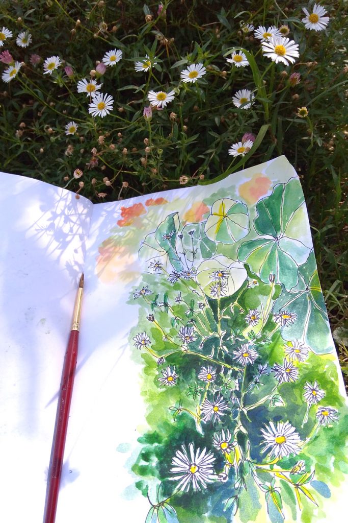
daisy garden sketch ©KarenSmith


Leave a Reply
You must be logged in to post a comment.