
Swatching out a new set of watercolours is something we all enjoy, but making them a useful painting tool can be even more rewarding by creating colour mix swatches.
Recently after a bit of an absence from painting I’ve come back to using my watercolours both in the studio and en plein air. I found that even though I’d got my enthusiasm to paint back, I had become a bit rusty over which colour palettes and mixes to use.
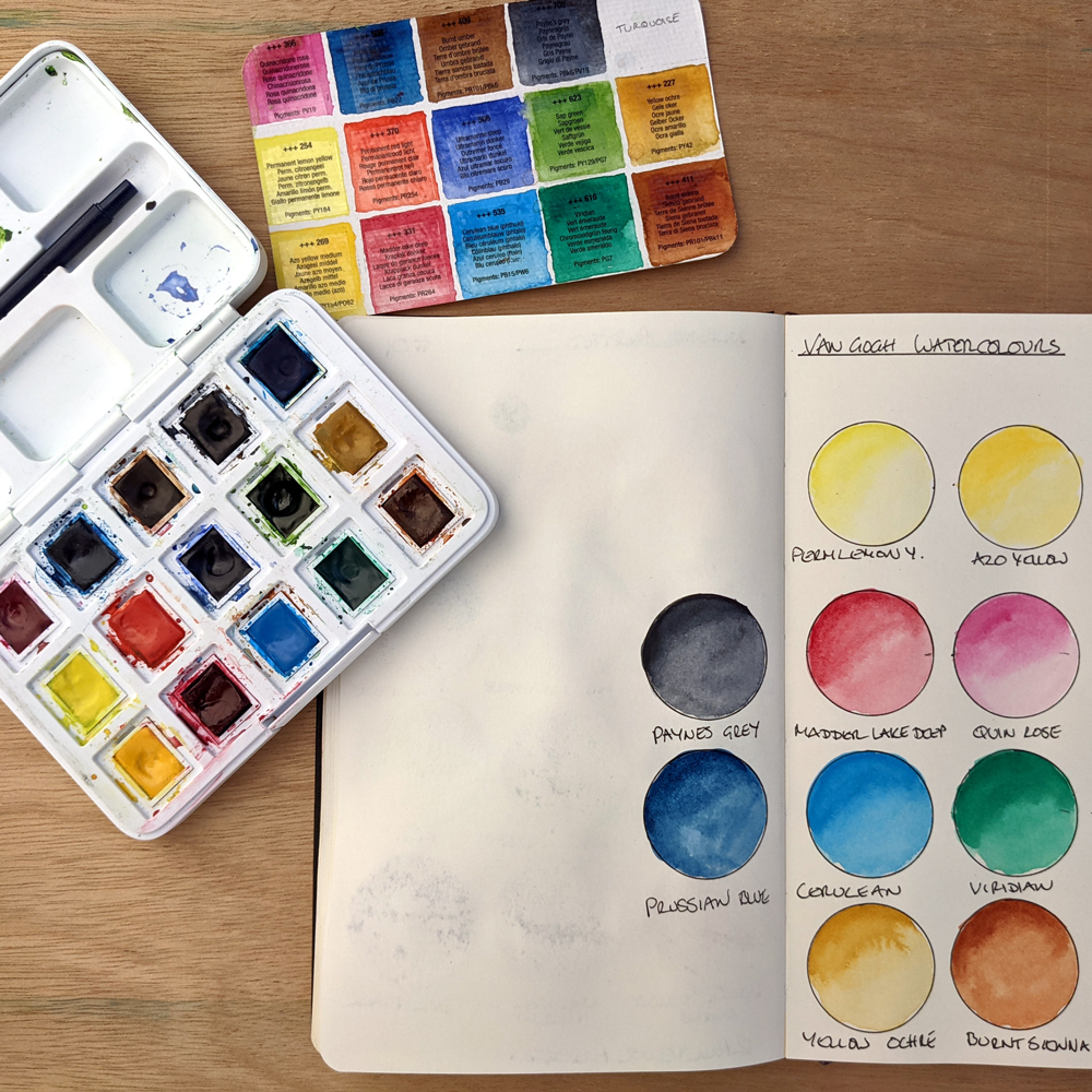
I usually paint out small watercolour swatches in my standard size moleskine sketchbook. I use it as a handy cross reference resource, mainly to compare similar colours across different ranges of watercolour manufacturers. I keep it clipped to the top of my drawing board.
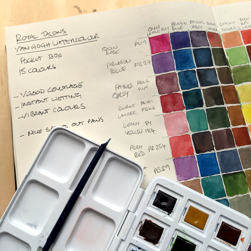
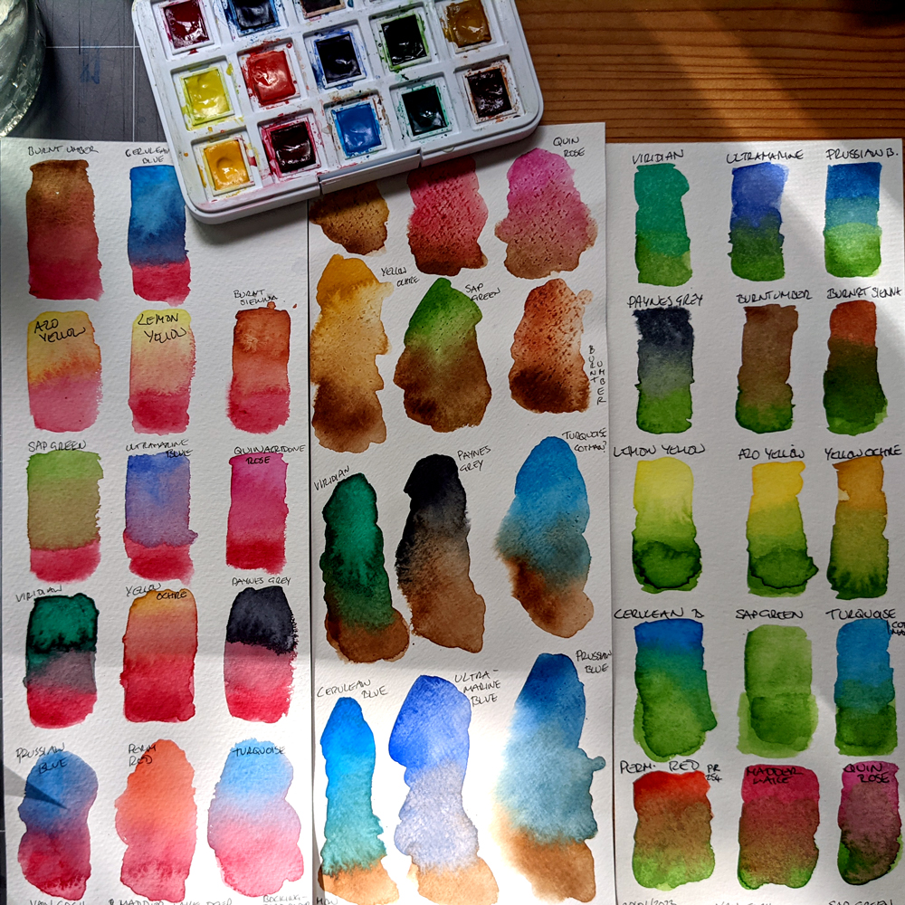
In addition to my usual single colour samples, I often create colour mix grids, which are useful as an exercise, but are quite big and run across 2 pages in my A4 sketchbook. Yes I do have a lot of sketchbooks!

Luckily during my lack of creative impetus I had kept my ‘hand in’ with colour swatching and also creating colour mix cards.
One of my lockdown purchases was a set of Royal Talens Van Gogh student set of 15 paints, which I swatched in my regular mix grid and single colour circle method.
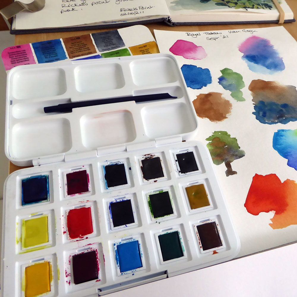
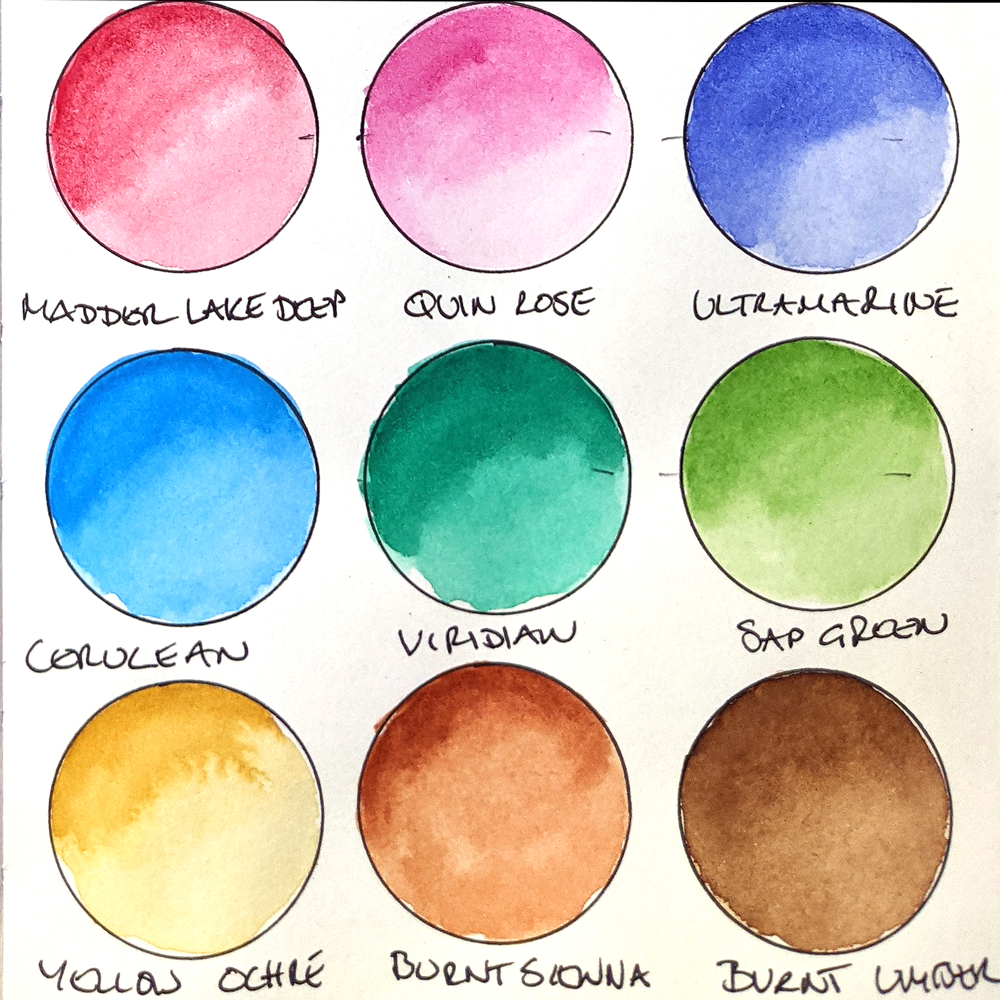
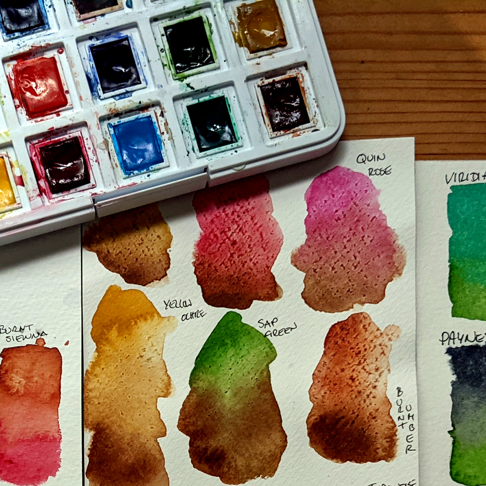
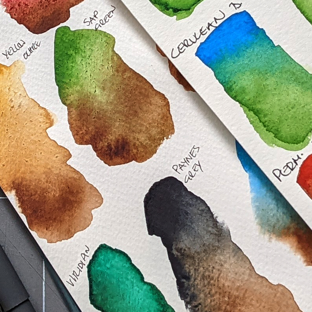
For some reason I also created some individual colour mix sheets for some of my favourite colours: Prussian Blue, Sap Green, Burnt Sienna, Madder Lake and Payne’s Grey.
I used some heavy, cold pressed watercolour paper sheet trimmings, approx 11′ x 4′ to create the colour mixes on, these sheets were robust and large enough to create good mix areas of paint, allowing the paint to spread out and (when it could) granulate.
I’d been fairly happy with these paints, but not amazed, and it wasn’t until I did these larger mixes that I could see how the mostly single pigment colours behaved really well with each other, creating some lovely subtle shades within each mix.
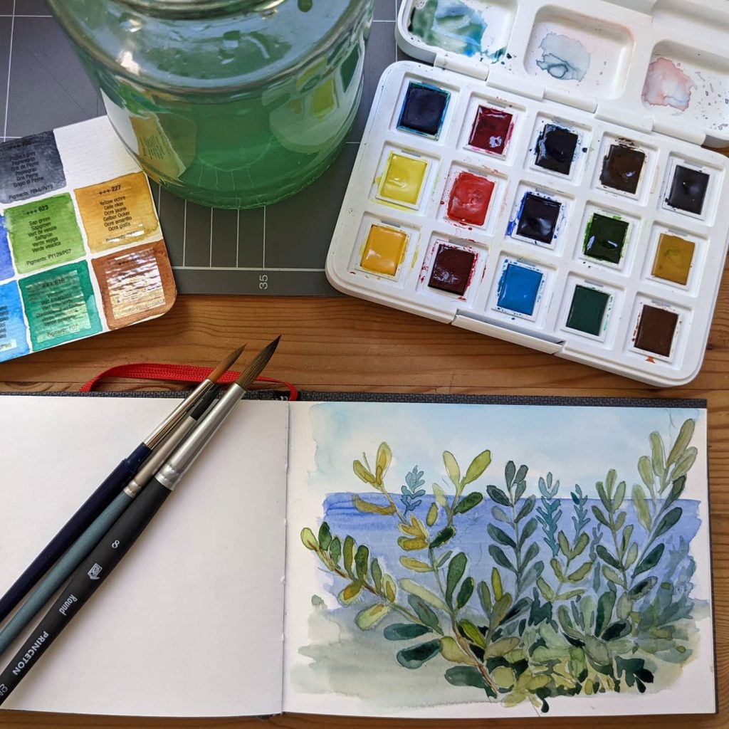
I used these cards as reference when I finally returned to plein air painting, the Burnt Sienna card with its Prussian Blue, Cerulean Blue and Ultramarine Blue mixes was so helpful, it immediately took away any guesswork over colours, and I was able to go straight from my quick pencil outline to the watercolour stage of this bayside study in my sketchbook.
At the moment this little watercolour box is my favourite sketching accessory, so I always pop the cards in with my book and paints when I head off out.
Leave a Reply
You must be logged in to post a comment.