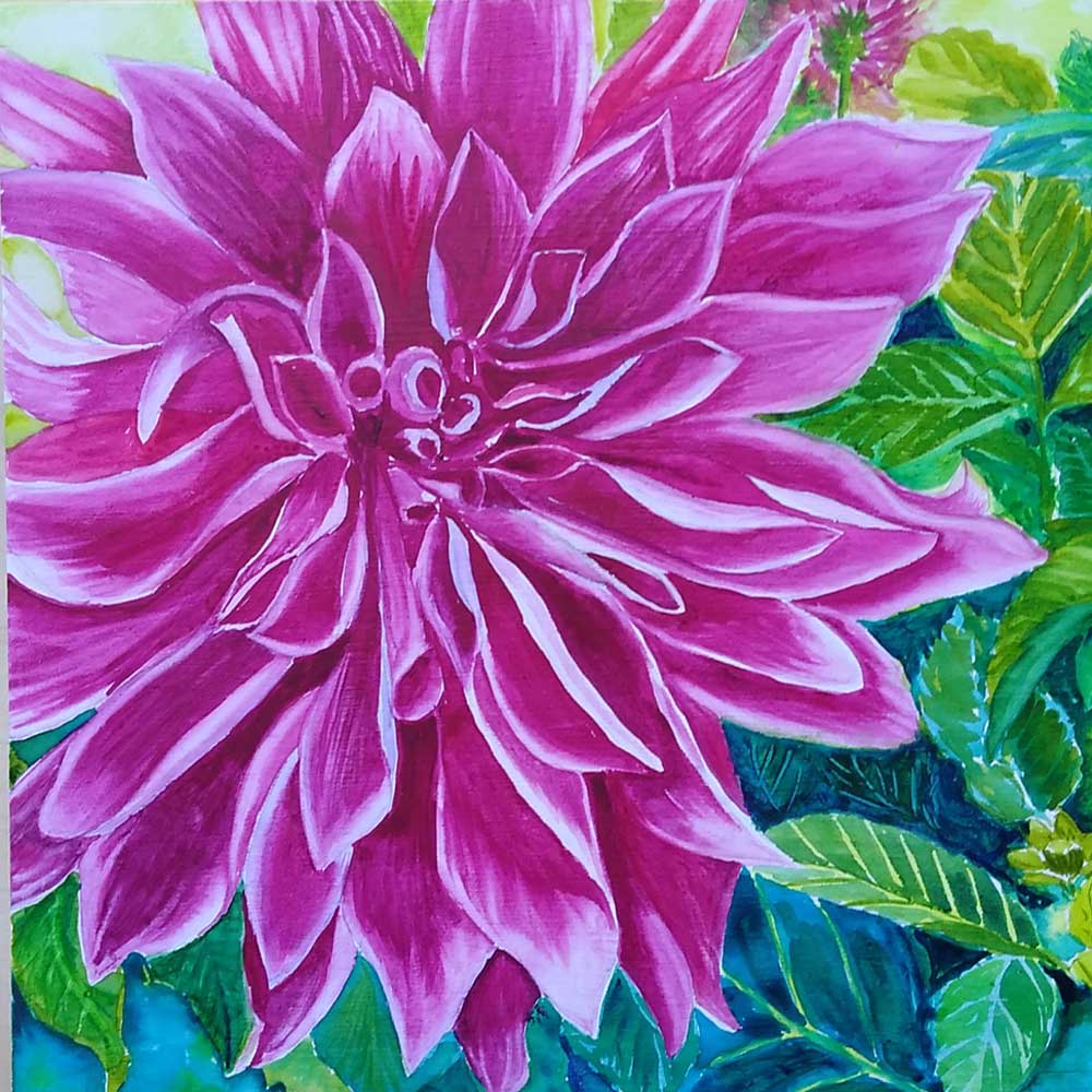
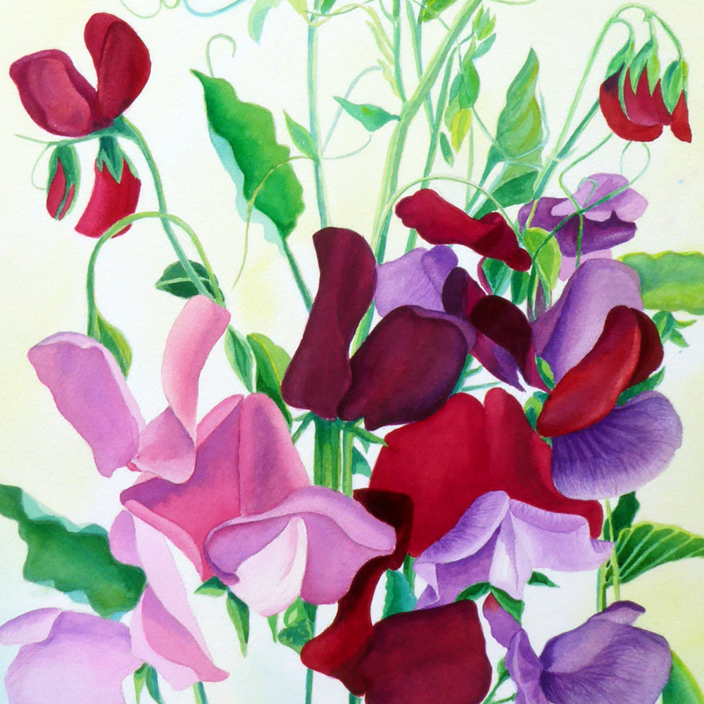
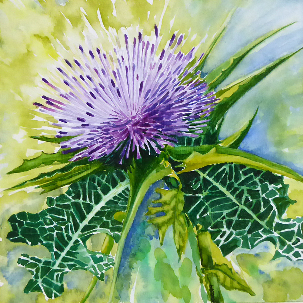
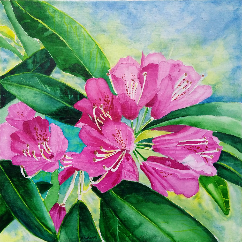
I do enjoy painting flowers in this colour range, including camellias, sweet peas, dahlias and thistles, and thought it may be interesting to go through the paint palette I have settled on over the years, specifically for painting pink flowers.
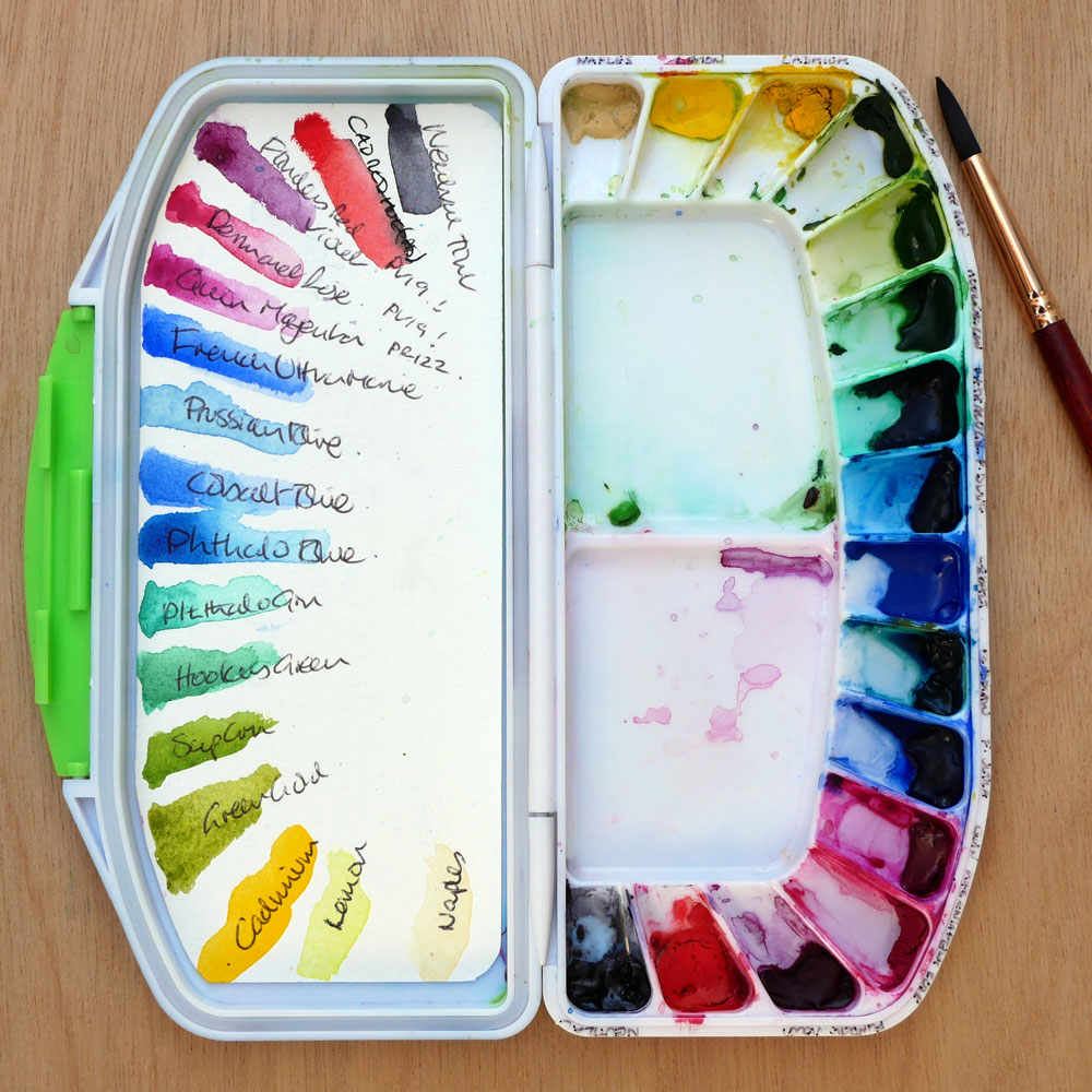
I have a few watercolour palettes that I keep on the go to suit the particular subject matter of a painting, one has a lot of blue tones, one a lot of green, and this one has pinks and greens and mixable blues for use with pink flower paintings.
The palette I use has two hinged parts, one with 16 wells, the other with a large mixing space, it’s designed to be portable, so has a rubber seal around the edges making it watertight – I haven’t put it to the test, as I usually let a palette dry or remove excess water before packing up!
Either way, I can fold it up and take it to classes and out and about. My other palettes are larger and open, and stay in my studio.
What Paints are in my Palette?
The colours in my palette are all watercolours, and from a few different manufacturers: Winsor & Newton (W&N), Art Spectrum (AS) & QOR . I buy them in tubes, mostly 5ml, with a few green & blue tubes at 15ml. Here is a list in their positions in my palette:
Neutral (AS) (similar to Paynes Grey) Cadmium Red Hue (AS) Flinders Red Violet (AS) Permanent Rose (AS) Quinacridone Magenta (QOR) French Ultramarine (W&N) Prussian Blue (W&N) Cobalt Blue (W&N) Phthalo Blue (AS) Phthalo Geen (AS) Hookers Green (W&N) Sap Green (W&N) Australian Green Gold (AS) Cadmium Yellow (AS) Winsor Lemon Yellow (W&N) Naples Yellow (AS)
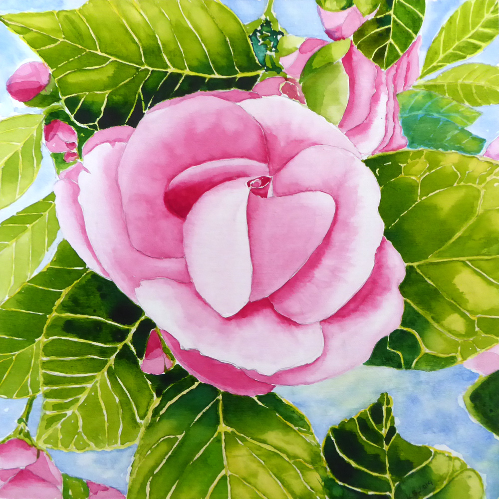
I like to use the layering technique in my flower paintings, often building up a few layers of single colour at a tie, then adding a new colour tint as a glaze. For example in my bouquet painting, the large pink flowering the centre has about 10 base coats of Permanent Rose augmented with Flinders Red Violet for shadows and Quinacridone Magenta to build up a depth of colour.
Adding the Cadmium Red to these 3 pink colours will give a darker and warmer peachy pink tone, and adding Cadmium Yellow will result in a lighter peachy colour. Adding the blues will give a variety of violets and purples, some more intense than others
Sap Green & Australian Green gold are my go to bases for foliage, I then add Phthalo Blue for darker yet bright colours and Cadmium Red to darken or ‘knock back’ the green, adding Winsor Lemon Yellow can brighten up Sap Green to a bright springtime green.
The palette is book ended with Neutral which can help create darker tones, and Naples Yellow – an opaque yellow that I seldom use except for highlights.